The client.
Shrpa is a spin-off of Merito, focusing on soft HR services such as talent acquisition, learning & development and talent management. With SHRPA, Merito Group can offer both hard and soft HR services, responding to growing market demand.


The concept.
Inspired by the Sherpas of Tibet, Shrpa’s new logo symbolizes the way up: a metaphor for the guidance the company provides in employees’ career development.

The design.
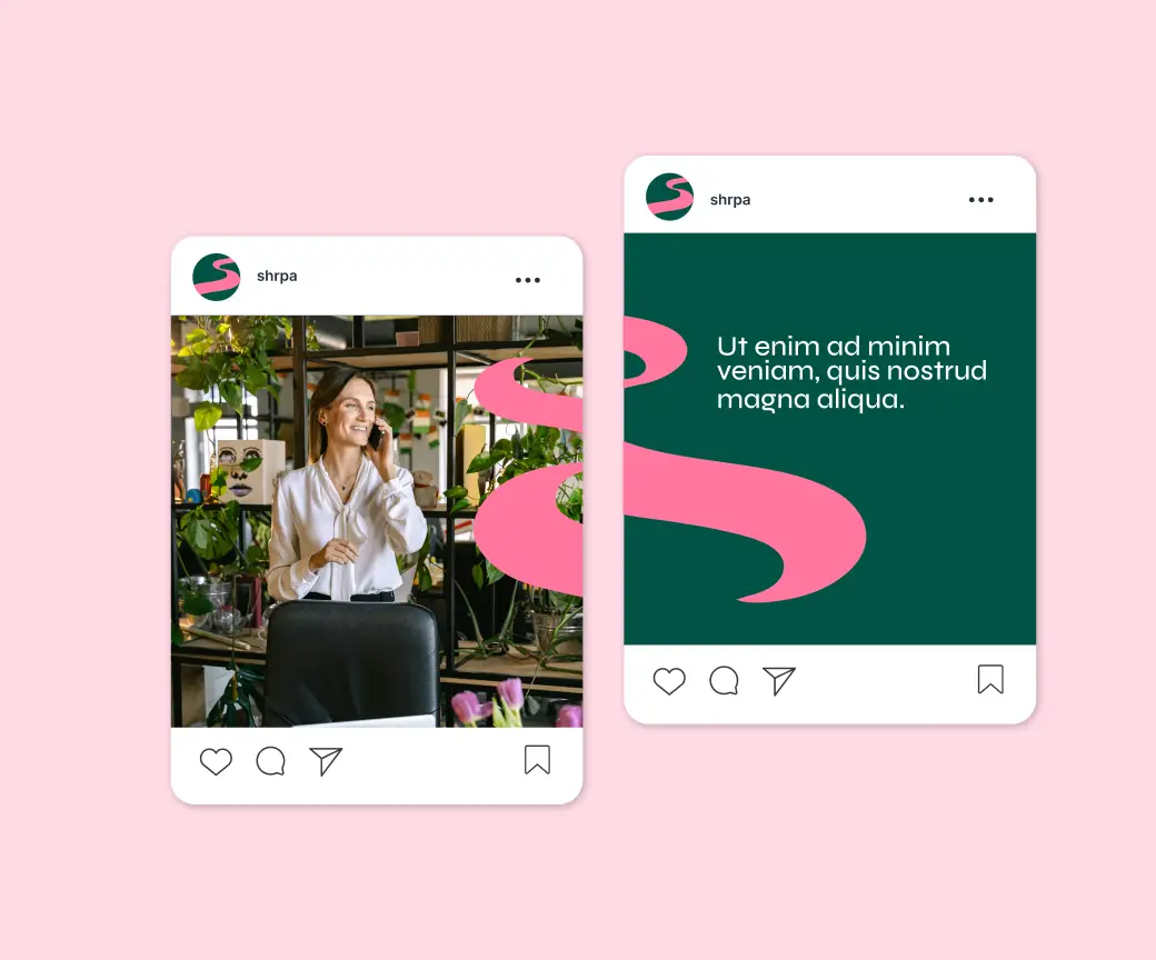
We chose a vibrant color palette and fluid shapes to give Shrpa a distinctive, dynamic look. This creates a fresh and contemporary feel without losing sight of professionalism.
The branding is optimized for social media, allowing Shrpa to reach and inspire its target audience with a strong visual story.


Brand guidelines.
To ensure consistent use of the new corporate identity, we developed digital brand guidelines that can be consulted internally and externally for the correct use of the logo, color codes, fonts and other brand elements. They are available via the Shrpa website, so everyone always has the most up-to-date information at hand.