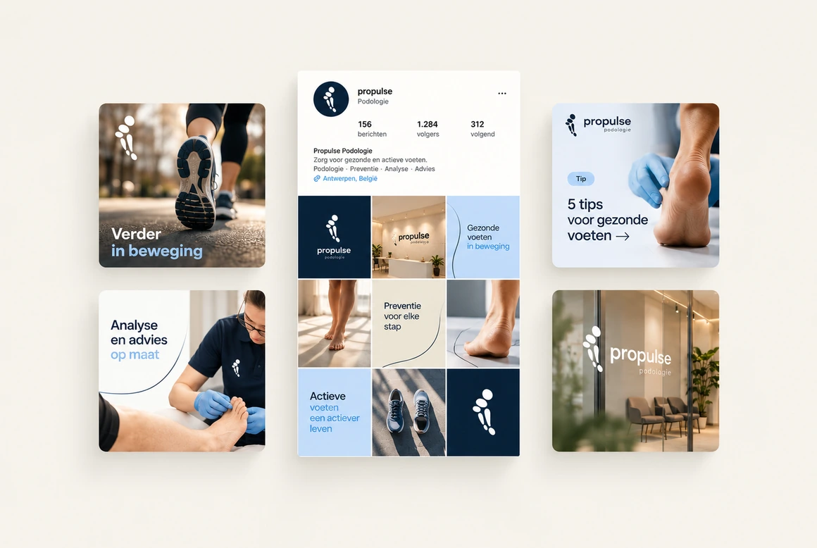
The brief.
Koen is an independent podiatrist. His practice looks beyond the feet: how does the whole body stand, step and move? He helps top athletes, children during their growth and adults who want to move comfortably and without pain.
For this broad audience, Koen asked for a visual identity that builds trust, radiates calm and still feels modern.

The approach.
We started from the way Koen works: personal, thorough and with an eye for the whole body. The identity rests on three building blocks: a logo, a color palette and a typeface. Deliberately kept simple, so everything can be applied anywhere and the practice reads as one whole.


The design.
The logo is the heart of the identity: clear, calm and instantly recognizable. The palette combines deep navy blue with light blue and warm beige: professional and trustworthy, yet soft enough to lower the threshold.
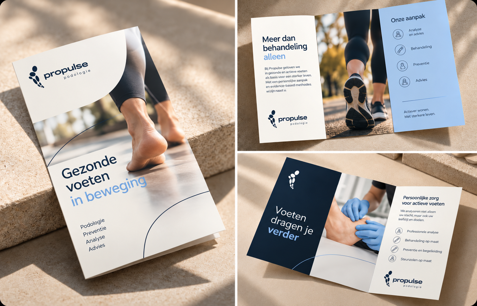
The application.
Logo, colors and typeface together form a compact foundation that stays recognizable in every application, from website and communication to documents and signage in the practice. This way the identity matches the practice’s slogan: every step counts.