The brief.
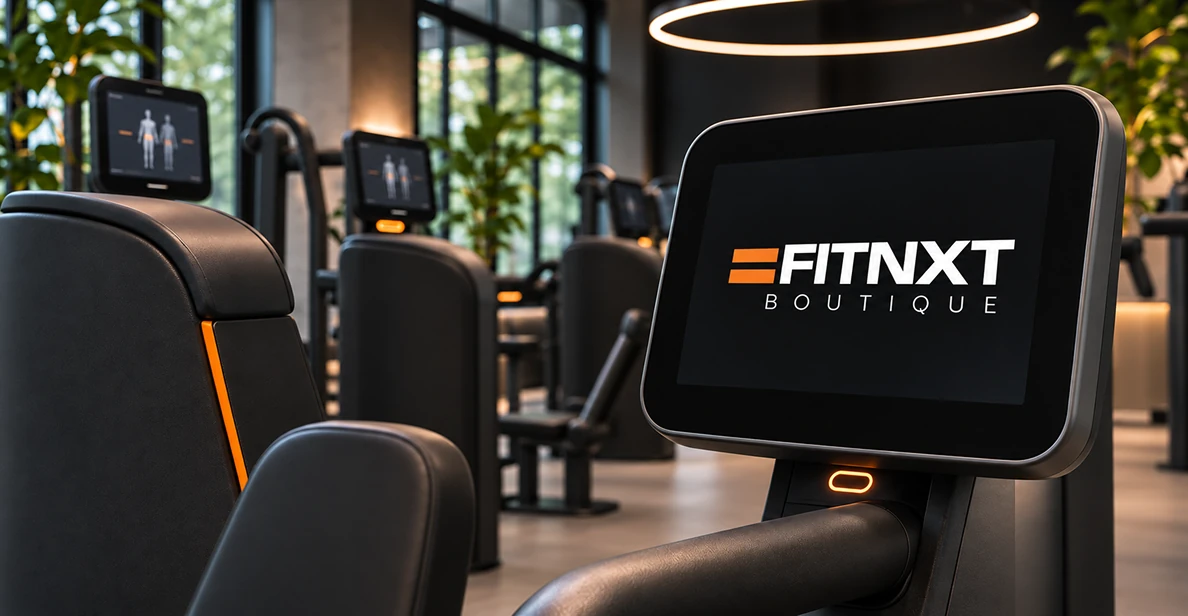
Fitnxt Boutique is a fitness concept where smart technology and personal coaching come together: 30 minutes of circuit training on EGYM Smart Strength machines, with progress tracked in the app. The brief: a visual identity that reflects the same quality as the coaching.
The approach.
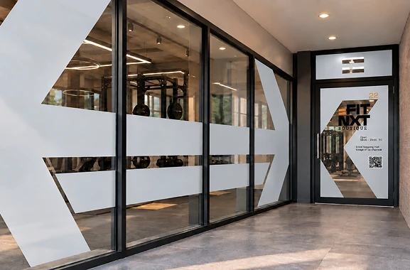
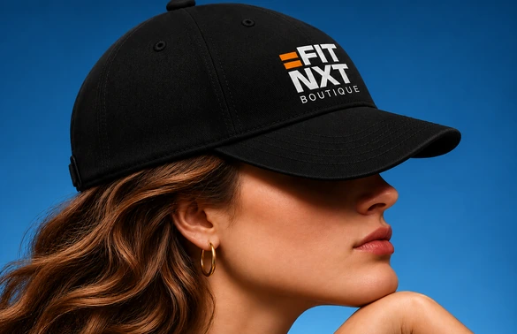
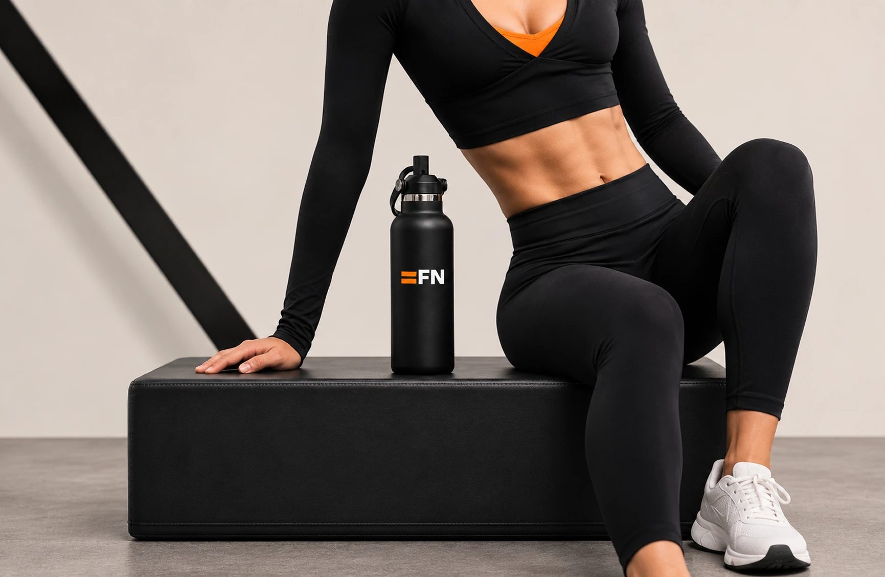
We started from the brand promise: your NXT level. The equals sign forms the basis of the logo and stands for balance and progress. From it came three logo variants and a compact FN icon, so the brand stays recognizable from the facade to the app.

The design.
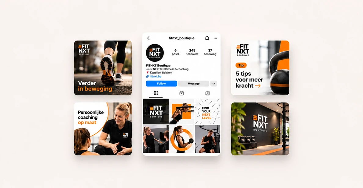
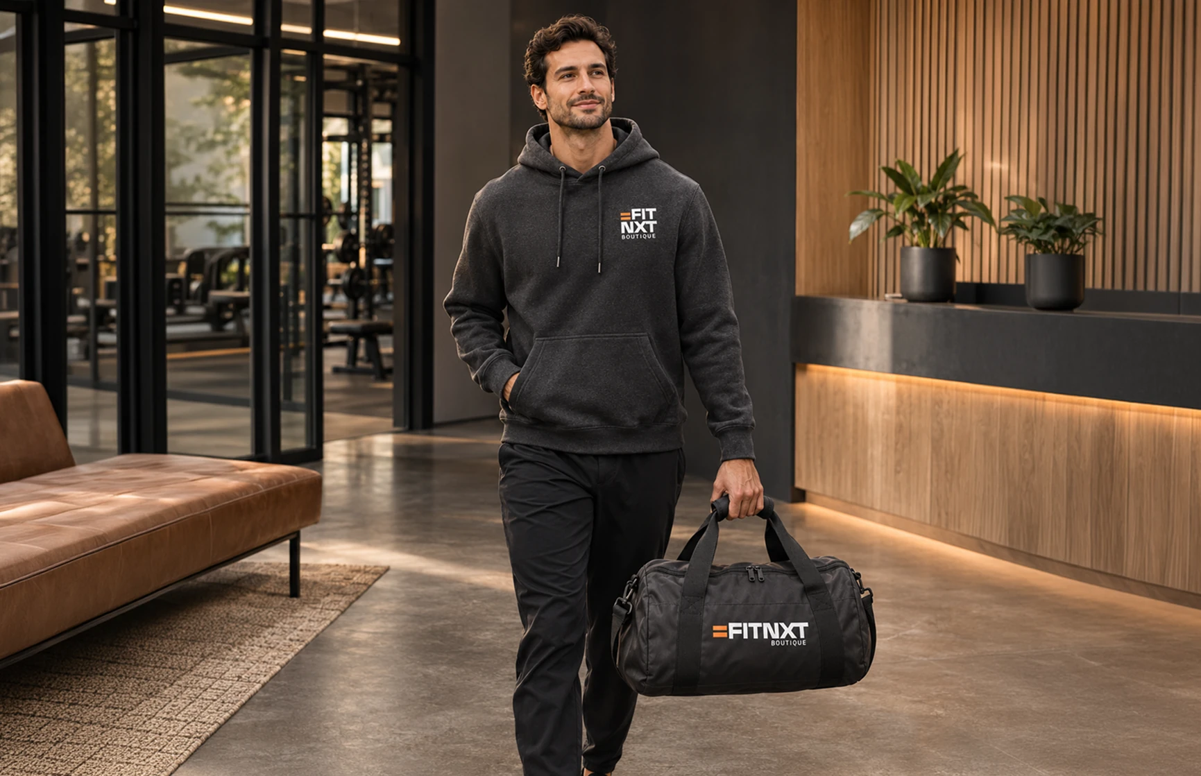
A strong, typographic logo in black or white, with orange as an energetic accent. Space Grotesk and Work Sans give it a clear, modern look. The logo can be placed in any corner of the layout, so it adapts to every image.
The website.
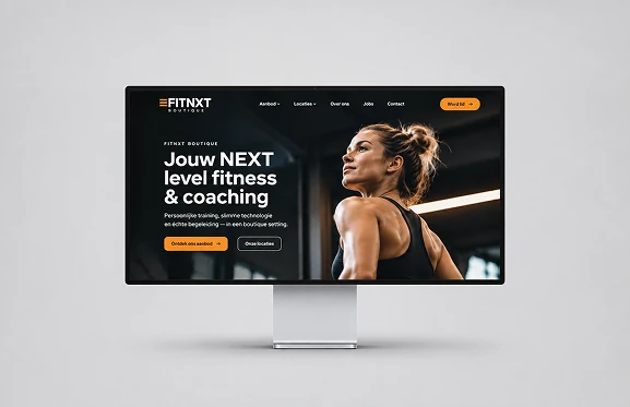
The website was built around the target audience: busy, results-driven people who mostly browse on their smartphone. That is why we designed mobile first, with short copy and clear buttons to book a trial session.
On the website, everything revolves around leads: every page leads to a simple form, so a visitor quickly becomes a new member.